Business needs
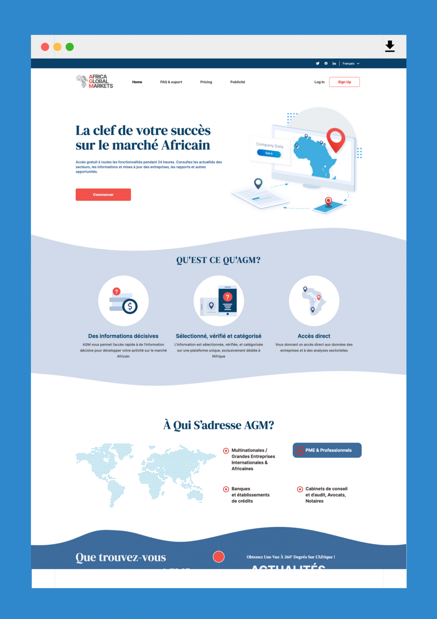
AGM team contacted us sharing a website with quite an outdated look and feel. Design was quite dark and bulky back then and product owner envisioned this as a possible issue. Some customers had issues navigating the catalog and overal lexperience was far from perfect.
During first discussions, product owner came up with main requirements: fresh and professional, easy to navigate and user friendly.
Idea
The requirements might sound quite common and obvious. But frankly speaking, it wasn't an easy job.The site is really big and has many filters, dashboards, charts, etc. Probably the most challenging for our designer was to create navigable and convenient for users mobile design.


